type for chicago, about CHicago, by a chicagoan.
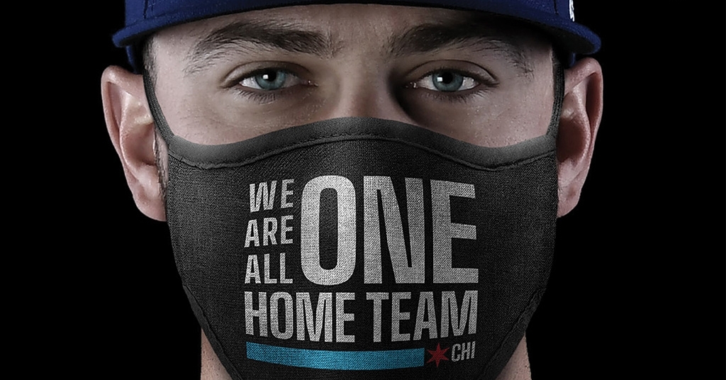

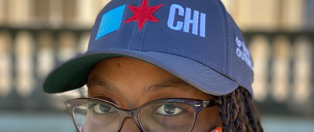
Big Shoulders is how we speak as one Chicago.
In 2018 the City of Chicago’s Design Director invited me to create all the type for the city’s first branding initiative, which launched on Chicago’s 183rd birthday.
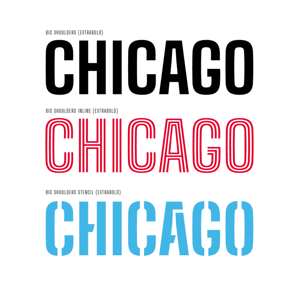
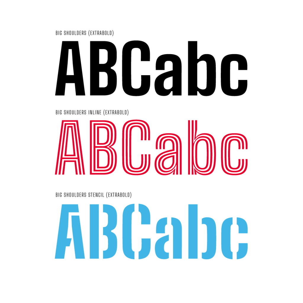
Big Shoulders, the city’s municipal typeface, is a collection of three related type families. All three are designed to express citizens’ participation in local culture. They’re all completely free to use, as is the city’s larger design system.
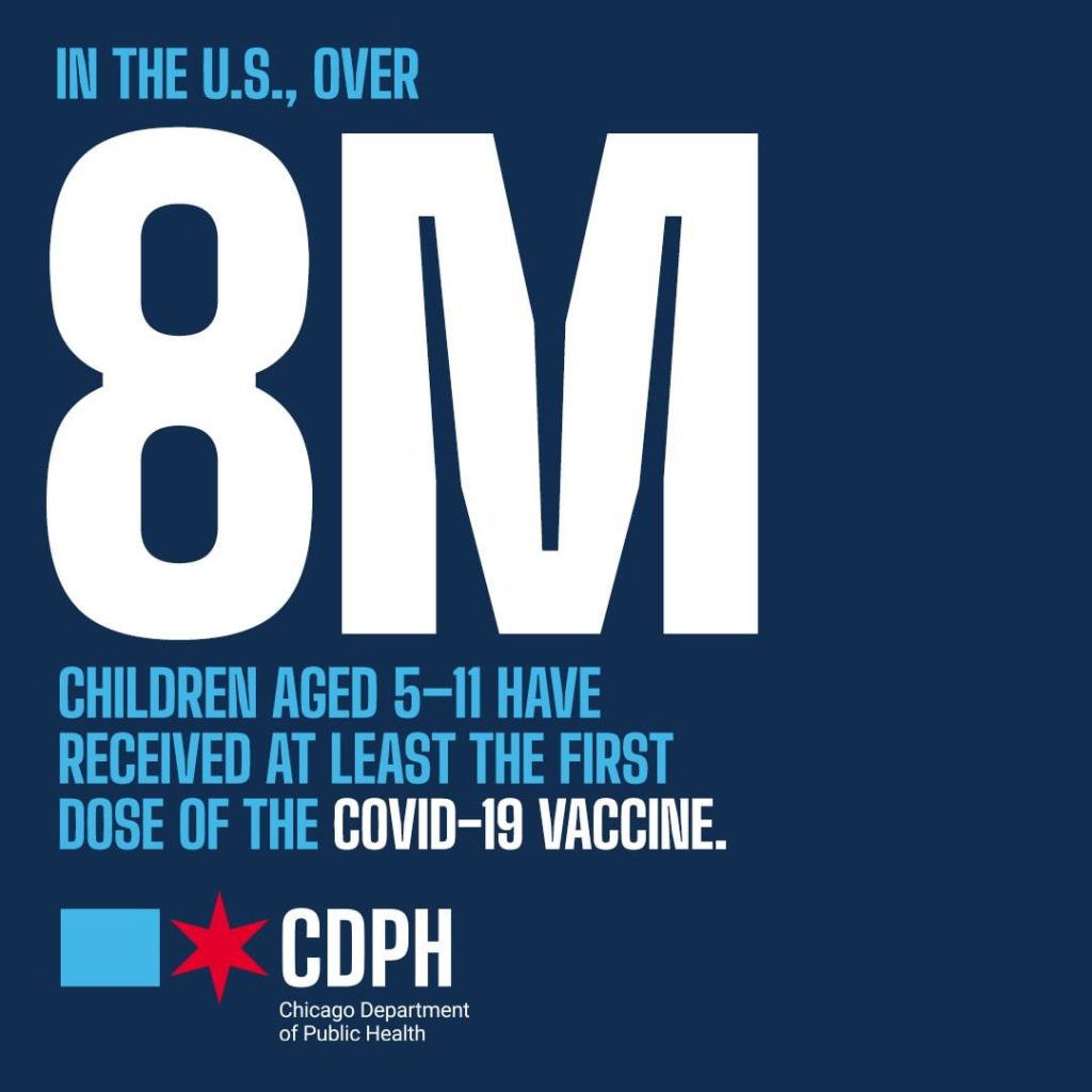
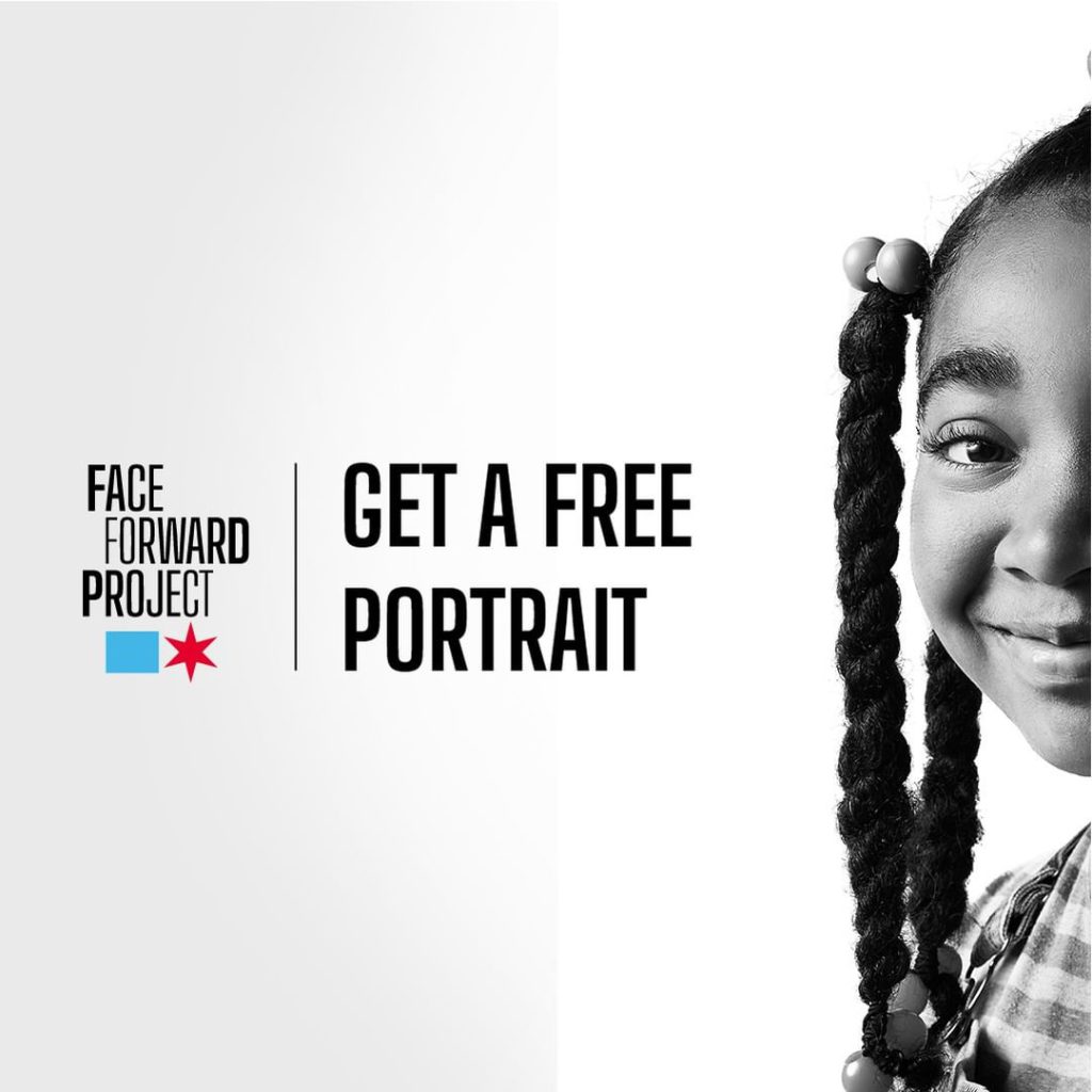
The Chicago Design System is a platform designed to build the city’s myriad departmental logos, messages, and signage pieces. Chicago launched the program two weeks before the 2020 COVID pandemic shut the world down. While we didn’t plan for it to become the voice of Pandemic Chicago, that was one of its first widespread uses, and the Chicago Department of Public Health rose to the occasion beautifully.
The collection is Big Shoulders, Big Shoulders Stencil, and Big Shoulders Inline, each in 9 weights from Thin to Black (the City uses ExtraBold for most of its work). The three families are all shaped essentially alike, and can be combined to easily create striking graphics.
Big Shoulders is 100% free to use. Get it at XO Type Co, Adobe, or Google.
Big Shoulders is specifically made to let Chicagoans find elements of the logo easily—the block and the star are in the font files—which means Chicagoan designers don’t have to guess.
It also means the city’s tattoo artists now have a definitive guide to making the city’s iconic six-pointed star. That’s important; Chicagoans are enthusiastic about their city flag tattoos.
Fun fact: I have been recognized in public exactly once as “The Big Shoulders Guy.”
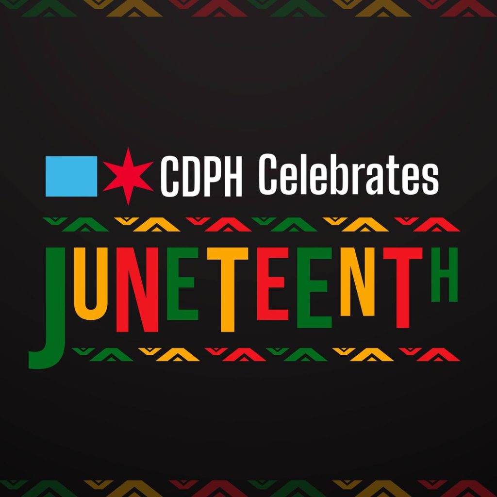
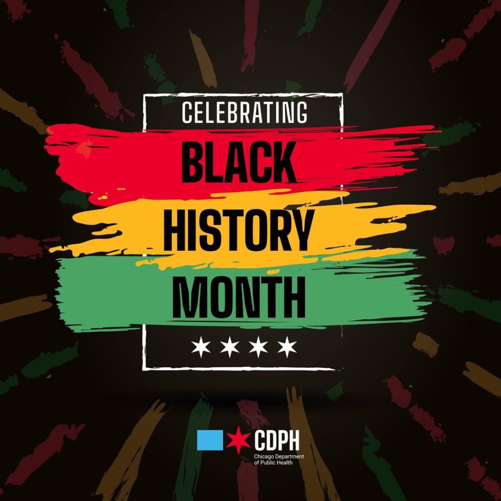
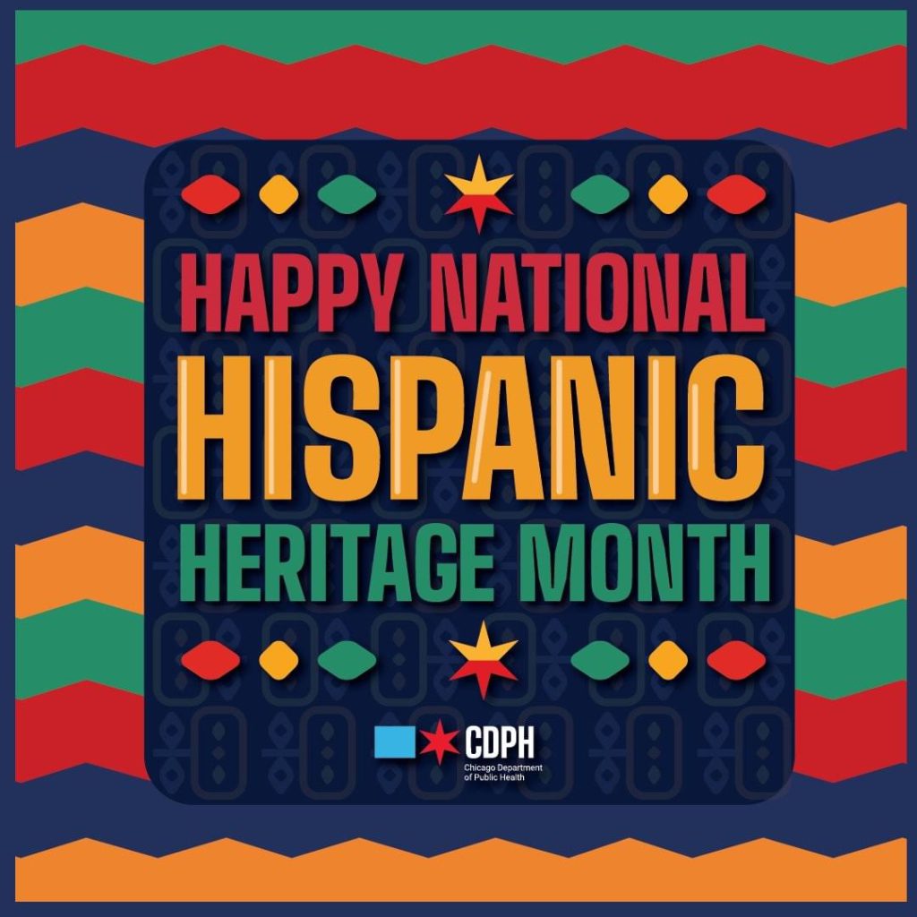
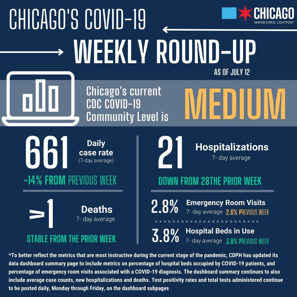
Below is some of Chicago Department of Public Health’s social posts during the pandemic, using Big Shoulders. CDPH”s messages of comfort, compassion, and solidarity have been absolutely exemplary.

